How Do Price Card Designs Impact the Way Customers View Your Shop?
How can you make a good first impression on new customers visiting your shop? The truth is, most people’s minds are already made up within a few seconds after entering your store about whether or not they’re willing to spend their money.
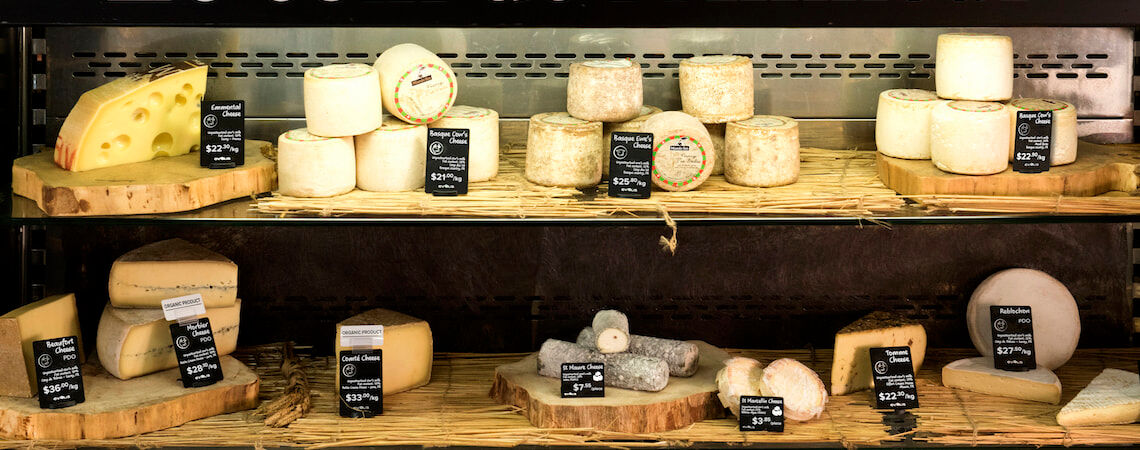
As well as good customer service and clean, clear and inviting interior decor, the design of your product price cards goes a long way in impacting the impression customers have of your shop. Essentially, price cards are an extension of your products themselves. Poor price card designs and materials reflect badly on your store and inventory, while effective designs emphasize key selling points and offer shoppers useful information.
Just cast your mind over the visual merchandising in your favourite shops. The chances are, they use effective price card designs that match store branding to make a good impression on passing shoppers. In this article, we explore the connection between price card designs and the way customers view your shop by drawing important lessons from some of the best.
Influencing Consumer Perception With Price Card Designs

Match Your Price Cards to Your Store’s Visual Branding
Every visual display used in your store contributes to a customer’s overall impression of your shop, including interior design choices, window displays and signage. All these things have the power to create a connection with shoppers and increase foot traffic and sales. Unfortunately, many shops fail to understand that price cards are an important part of this strategy for maximizing the visual appeal of your store and products.
By matching your price card designs to your store design, you can improve the customer experience by creating better synergy between your different in-store marketing materials, telling customers that you have strong brand consistency.
Best practices can be used to impact the kind of environment you create for shoppers. For instance, you can use black and white price card designs to match almost any store theme or layout. However, you can also adapt your colour choices depending on the kind of atmosphere you are trying to create, such as seasonal themes.
Create a Personal Connection Using Custom Fonts
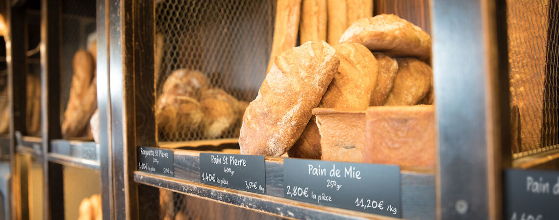
Price cards are seen by customers as a direct message from the store. The message you convey will depend on your brand and products, but by using customized styles such as handwritten fonts, you can create a stronger personal connection with your customers.
Simply by crafting carefully chosen messages in custom fonts to accompany your product name and descriptions, you can significantly improve the impression customers have of your store, improving sales.
Build Greater Trust With Clear Allergy Information
Consumers with serious allergies don’t just grab the first set of products they lay eyes on. In fact, for those who have certain intolerances, buying food products involves reading through the product’s entire package description to check whether the item is safe for them to consume. Others who have strict eating preferences, such as vegans, will also perform this task on a regular basis.
Stores that use price cards to clearly notify shoppers of allergy information can build greater trust with customers, especially those who are from overseas or can’t read product descriptions in a specific language. Alternatively, you can notify customers that a product is free of such ingredients with price cards that say things like: “Gluten free”, “No nuts” or “Vegan”.
Success Stories
Durable and Hygienic Price Card Designs for Bakeries and Food Stores
Many food stores suffer from easily damaged product displays made from poor laminated paper or cards. While this method is relatively cheap and simple to use, these cards have low durability and require regular replacement after they are washed or exposed to moisture. The homemade bakery and food store “Baker & Cook” had this exact problem with their laminated POPs, which deteriorated soon after being washed.
To solve the issue, “Baker & Cook“ invested in a price card printer recommended specifically for bakeries and pastry shops. This printer used PVC materials and offered designs in a matte finish and multiple colour choices that would be less prone to water damage, making them last much longer than their previous card designs.
By using this new price card production method, the bakery was able to benefit from longer lasting and more hygienic product display cards, which could be easily cleaned and maintained. Additionally, they are now able to create displays that are more attractive, clear, and consistent with core branding to enhance the overall experience for customers.
High Quality Price Cards for Luxury Hotel Buffets
In some environments, standard price cards simply don’t work with strict branding requirements. For example, The Grand Hotel River Park hotel, a five-star establishment belonging to the Marriott Group's Luxury Collection, requires their entire guest experience to be of the highest quality.
A new display card printer allowed them to implement easy design customization to match their brand,
creating displays that perfectly complemented the level of luxury and elegance that their guests expected as part of their buffet service. This also helped them to adapt displays for multiple languages and notify guests of important food ingredients. For example, vegetarians were notified with green display cards while certain allergy risks were highlighted to other guests.
As The Grand Hotel River Park hotel learned, price tags can be adapted to support the high standards found in the hospitality sector where quality and consistency are paramount.
What Makes an Effective Price Card Design?

- Combine effective color choices and clear designs that match your store’s brand
- Use high quality materials to improve durability and hygiene levels
- Address customers directly to build a stronger connection
To sum up, your store’s price card designs should work together with your overall visual merchandising strategy to deliver a positive experience for shoppers, whether they’re regulars or brand new. By putting these 3 core strategies into practice, you’ll be able to build better connections with your customers; emphasize the benefits of certain products, and improve the overall brand image of your store.
As we’ve learned from both homemade bakeries and luxury hotels, people are sensitive to the way that products and items are presented using visual displays. So regardless of your product offerings or thematic design choices, consider how you can improve the way your customers see your store through effective price card design
