Find the Best Price Cards for Your Store!
Price cards are an essential communication tool for selling products. Some would even argue that price cards are the determining factor in whether a customer does (or doesn’t) buy your product. Whether you believe this or not, there’s no doubt that a price card, along with other visual merchandising tools like POPs, have a great influence on a customer’s purchasing decisions.
With this in mind, do you know how to choose the best type and size of price card for your products to maximise their ability to entice shoppers? If not, don’t fret — we’ll explain everything!
What Types of Price Cards Are There?
Simple Price Cards That Display Product Names and Prices
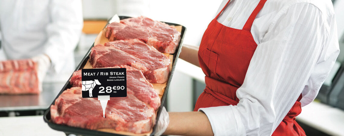
There are several different types of price cards you can choose from, but many supermarkets stick to simple designs that display product names and prices only. This is a tried and tested method that works in all kinds of shopping environments and is particularly good at appealing to price-conscious shoppers.
To get this right, make it easier for people to see your prices at a glance by displaying them with greater prominence on the card layout, using a larger font size or placing the actual price higher up the card so it’s the first thing people look at.
Price Cards That Include Promotional Messages
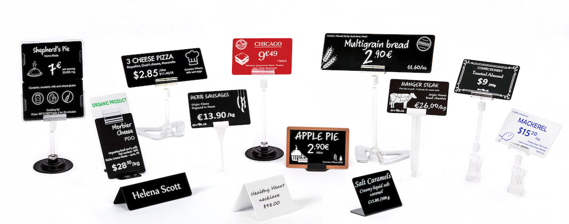
You’ll often see price cards that convey promotional messages in addition to essential product information. Many supermarkets use messages like “Homemade” or “No.1 Bestseller” to entice passing shoppers into paying greater attention to specific products.
By doing so, you can boost the potential of your price cards to influence your customers’ purchasing decisions, drawing from the power of visual merchandising and POPs to create a stronger connection with your customers.
Price Cards That Use Special Layout Designs
You might not have realised this before, but price cards come in hundreds of different layout designs. Also, did you know that they have a huge effect on the overall atmosphere in your shop?
When browsing popular stores that are known for being “fashionable” or “cute”, there’s no doubt that unique price card designs have contributed to this feeling. Whether it’s rustic, wooden price cards used in shops that want to create a natural and organic environment, or bright and colourful displays for quirky fashion stores, price cards are a great way to support your store’s brand and image.
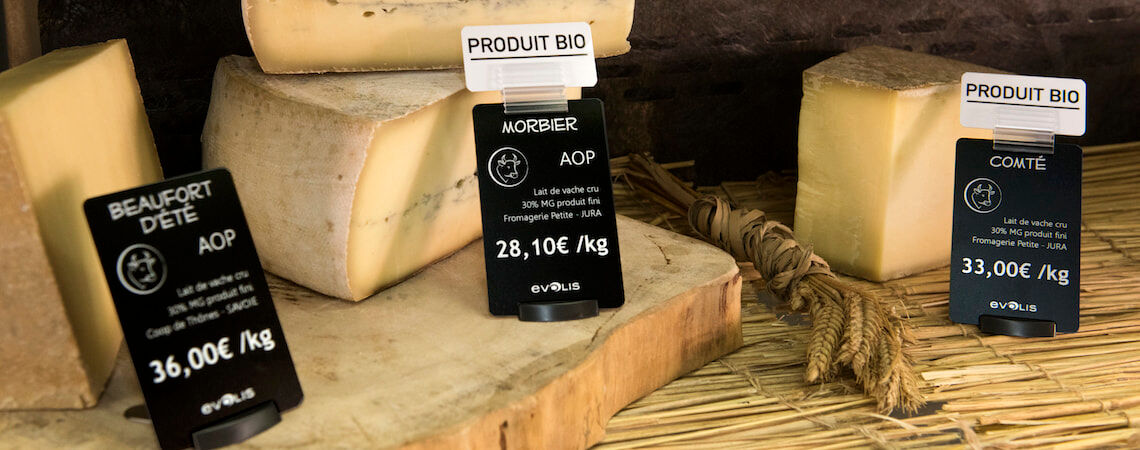
You can easily adapt your price cards and POPs to establish a certain look and feel in your store, complementing your products and enticing shoppers to pay attention. And when in doubt, remember that the classic white-on-black price card design is a reliable choice for stores that want to convey a stylish and luxurious atmosphere.
What Size Should Price Cards Be?

Credit Card-Sized Price Cards
Although the size of a price card can vary depending on branding considerations and products, one of the most common sizes used is similar to that of a standard credit card. This would make the card around 85.6mm x 54mm.
This price card size offers decent capacity for basic layout options, where key information can be balanced with allergy advice and prices. Anything smaller than this and your layout might look too cluttered when trying to fit everything in.
There’s no strict guideline here. If you find that you can emphasize your products’ appeal better with a smaller price card size, this is also fine. Alternatively, you can also make a strong impression by using large sized price cards. Just be careful to match your choices with specific products and the branding of your store.
Horizontal vs. Vertical Price Cards
Include important product information and allergy marks as well as branding elements such as logos to appeal to your customers.
As well as playing with the size of your price cards to achieve different effects, you can also adjust the orientation from horizontal to vertical. You might prefer this option if you believe standard credit card-sized price cards are too basic for the kind of products you are selling. Or you might simply want some variation to distinguish certain collections and ranges within your store.
As long as you allow for sufficient width and height, you can easily
include important product information and allergy marks as well as branding elements such as logos to appeal to your customers with a vertical price card layout.
How to Choose the Best Price Card for Your Store

Choose Your Price Card Layout Based on Your Brand and Target Audience
Your price card designs should be based on your branding and what you know about your customers.
Like all great marketing materials, your price card designs should be based on your branding and what you know about your customers. Always approach your visual displays from the perspective of your target audience, and think about what will appeal to them and encourage them to purchase your products.
There’s no use having amazing price card designs with bespoke illustrations if they’re not actually enticing people to make a purchase. Similarly, if your brand embodies sophistication and luxury, basic price card designs simply won’t cut it. It’s best to make a strategic decision about your price cards based on your customer research data.
Take Advantage of a Customizable Price Card Printer
The best way to implement the various tips and tricks we’ve outlined for choosing the best price card designs for your shop is to invest in your own customizable price card printer. The main reason for this is that it gives you more control over exactly what your price cards look like and say.
If you already have a clear idea about which kind of price cards will work best with your store and customers, a customizable price card printer will allow you to improve efficiency and quality, achieving consistent results time and again. New technology makes it simple to play with all kinds of features like layout designs, orientation, font sizes and graphic styles to achieve the perfect price cards for any environment.
In the end, people are massively influenced by visual merchandising, displays, signage and price cards in the shops they enter. An effective price card strategy lets you maximise your sales potential, improve competitiveness and strengthen your branding.
